


A room can feel like a hug or a high five. It can push you to focus or pull you to rest. The secret behind these feelings often lives in the colors on the wall. People pick shades they like, but there is a deeper method to it.
This method comes from a Dubai interior designer who knows how color speaks to the brain. The right hue can shift energy, calm nerves, or spark creativity. Here is how color choices shape the way a room feels.
Red brings energy and warmth:
Red is a bold choice. It raises heart rates and stirs excitement. Designers use it in dining rooms to encourage lively conversation. In entryways, a pop of red makes a strong first impression. But too much red can feel aggressive. A single red chair or a stripe of red on a neutral wall gives the effect without overwhelming the senses.
Blue calms the mind:
Blue pulls us toward quiet. It slows breathing and soothes thoughts. Soft blues work well in bedrooms and bathrooms where rest is the goal. Bright blues add focus, making them a good fit for home offices. Designers often pair blue with soft whites.
Yellow sparks joy and creativity:
Yellow holds the sun. It lifts spirits and wakes up the brain. Kitchens and playrooms benefit from sunny yellows. Muted yellows, like butter or honey, add cheer without screaming for attention. Too much bright yellow can cause strain, so designers use it in small bursts or on accent walls.
Green connects to nature:
Green sits easy on the eyes. It reminds us of trees and open fields. This color reduces stress and brings balance. Living rooms and reading nooks feel fresh with sage or mossy greens. Green also pairs well with wood tones and plants, creating a peaceful flow from inside to out.
Purple adds a touch of luxury:
Purple carries a sense of royalty and depth. Light purples like lavender help people unwind. Darker shades like plum add drama and richness. Designers place purple in bedrooms or cozy sitting areas where a hint of elegance feels right. Used sparingly, it adds personality without shouting.
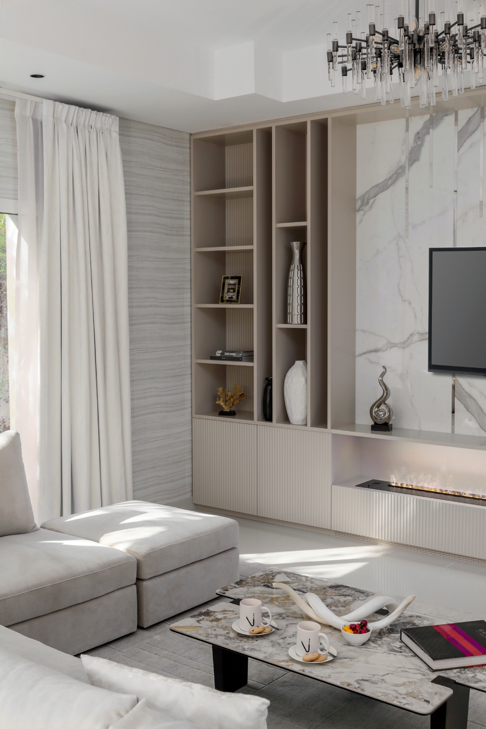
Neutral tones create comfort and flexibility:
Beige, gray, and ivory are the quiet heroes of design. They do not fight for attention. Instead, they offer a soft backdrop for life to happen. Neutrals make rooms feel open and calm. They also allow people to switch decor easily without repainting.